Your Octopus tariff. On your wrist.
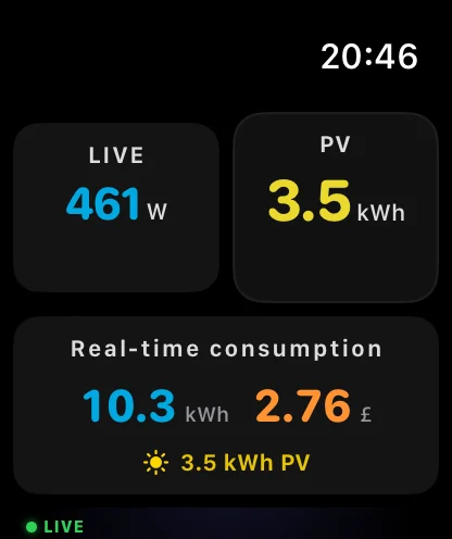
Current Spot shows today's and tomorrow's rates, the cheapest slots and what your home is using right now. On Apple Watch first, and on iPhone, iPad and Mac.
Independent app. Not affiliated with or endorsed by Octopus Energy.
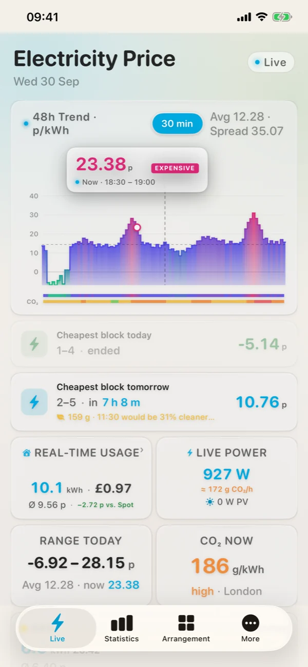
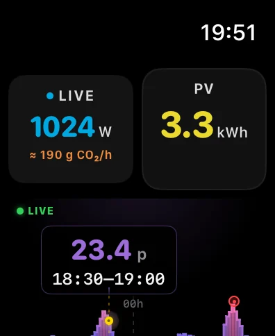
Not just Agile.
Every tariff gets the view that makes sense for it: half-hourly prices for Agile, the daily rate for Tracker, off-peak windows for Go and Cosy, a clear overview for Fixed.
With your account, or without.
Without an account
Pick your region (A to P, 14 regions). You get Agile prices for today and tomorrow, the cheapest blocks and carbon intensity for your area. Nothing to sign up for.
How it works →With your Octopus account
Sign in to Octopus inside the app, or paste your API key and account number. Current Spot then knows your exact tariff, your smart-meter usage, your bills and, with a Home Mini, your live power.
Connect your account →The watch is the point.
Price on the watch face, a 48-hour chart, the next cheap slot and live watts. One glance, no phone.
All devices →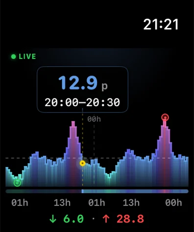
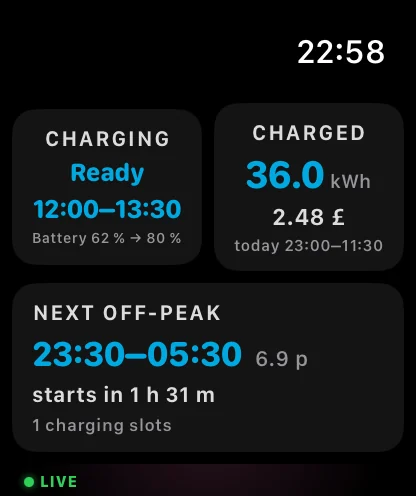
Know when the car charges.
Your smart-charge slots, how much went into the car and what it cost, and when the next off-peak window starts.
Intelligent Go in detail →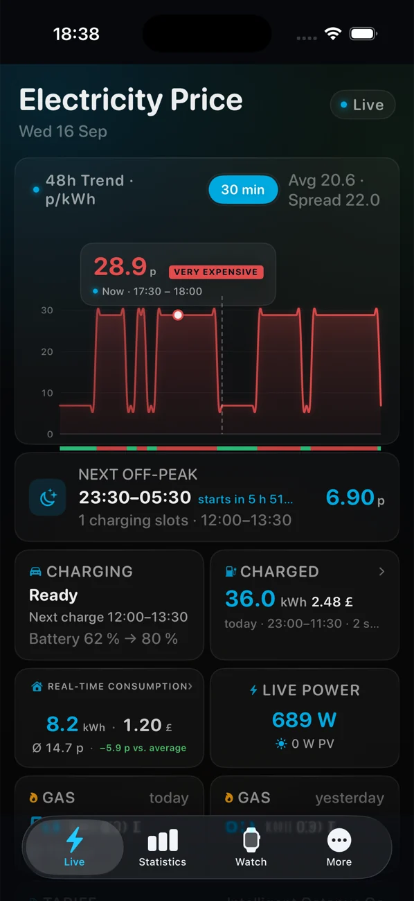
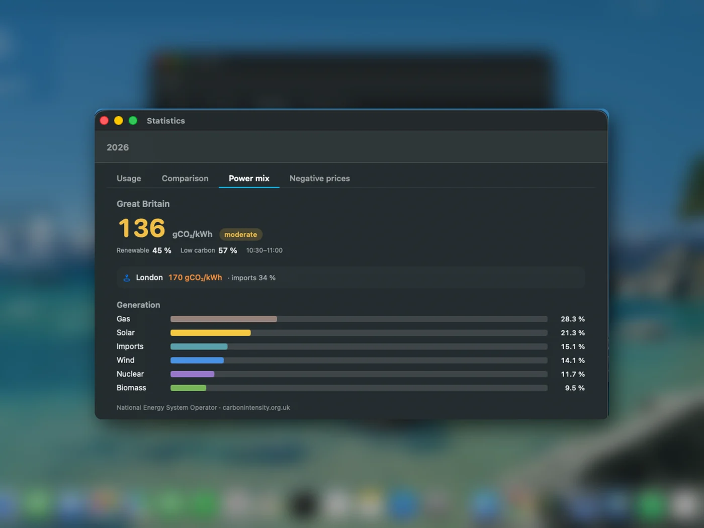
Cheap and clean.
Regional carbon intensity from NESO with a 48-hour forecast, free for everyone. With Premium, Current Spot picks the cleaner slot when prices tie, and on Fixed and Flexible it finds the cleanest window of the day.
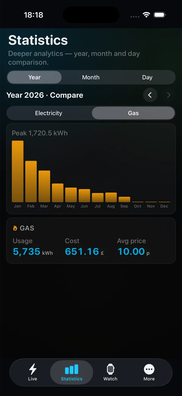
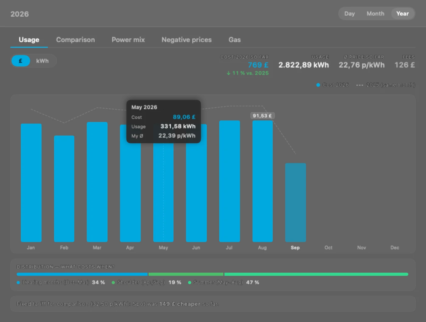
Day, week, month, year.
Electricity and gas from your smart meter, priced with your own rates. Your Octopus bills next to the app's numbers, so you can see they match.
Bigger screens. Same numbers.
On the iPad a full-screen dashboard for the kitchen or a stand. On the Mac the price sits in the menu bar and the dashboard is one click away.
All devices →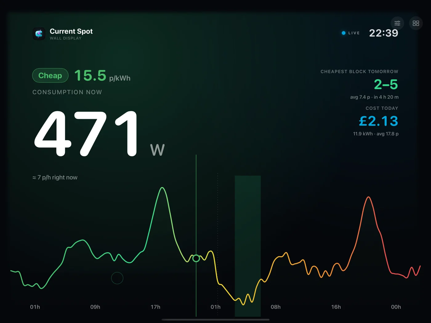
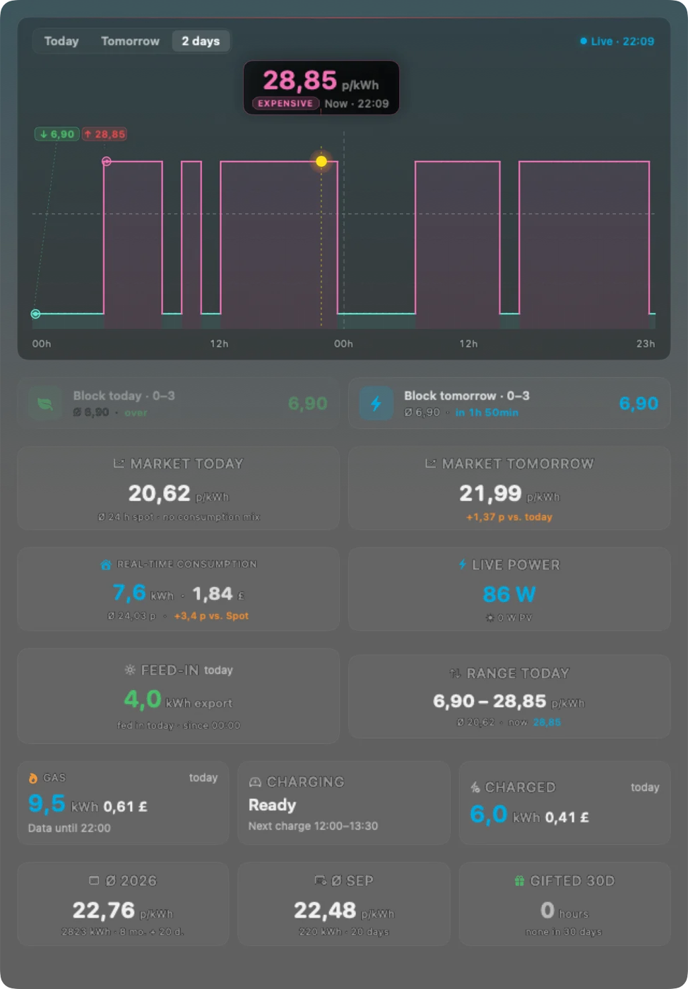
Current Spot covers 12 countries in Europe, with Tibber or without an account.